I worked up quite a few different UI art-style mock-ups for an in development game. The games art direction really was a moving target throughout development.
I tried lots of different UI art styles to try and help the decision making along.
I had a lot of fun trying out different looks, however the project was eventually cancelled due to other studio priorities. (These are just a selection of all the art styles created.)
'Book'
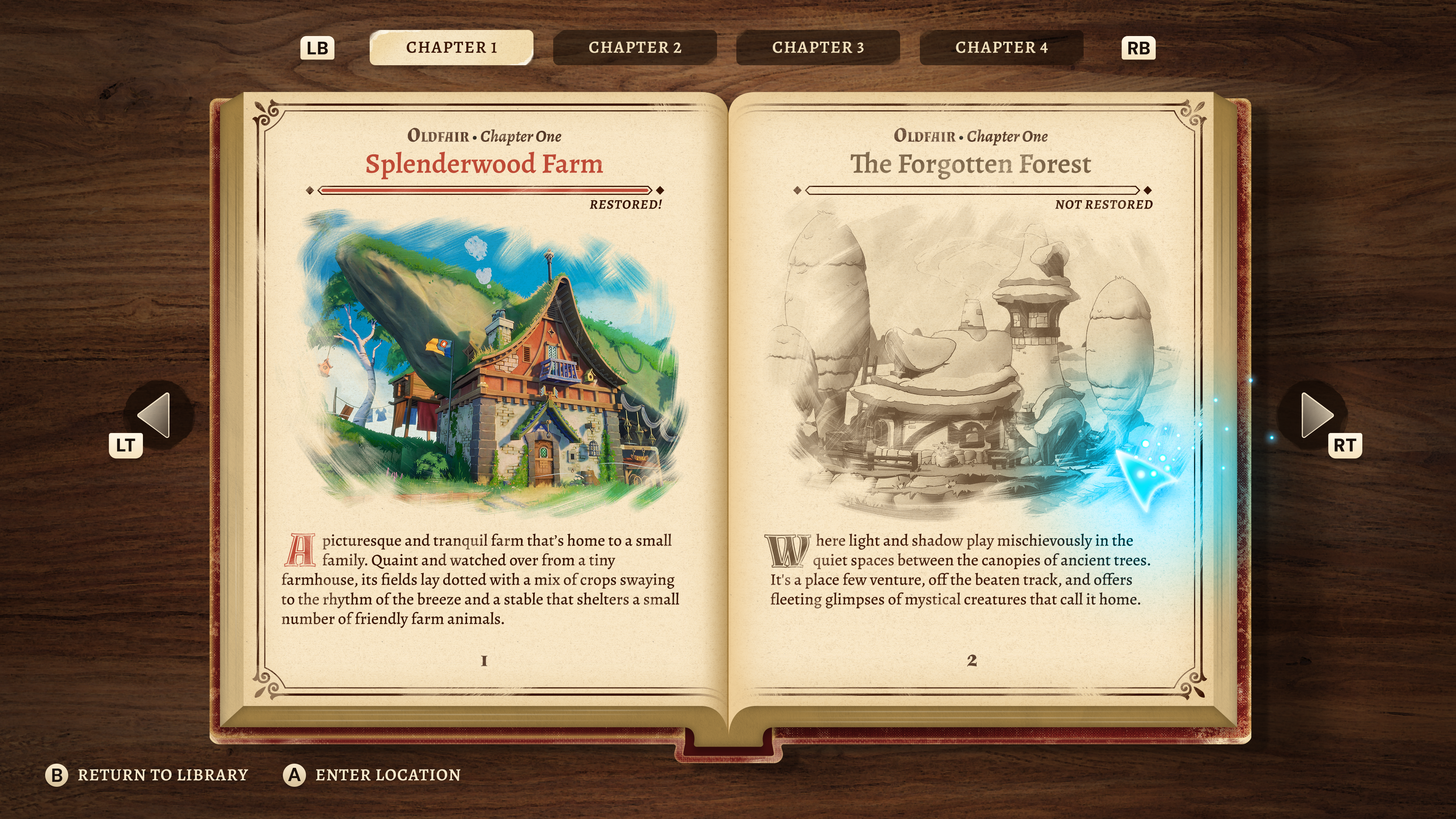
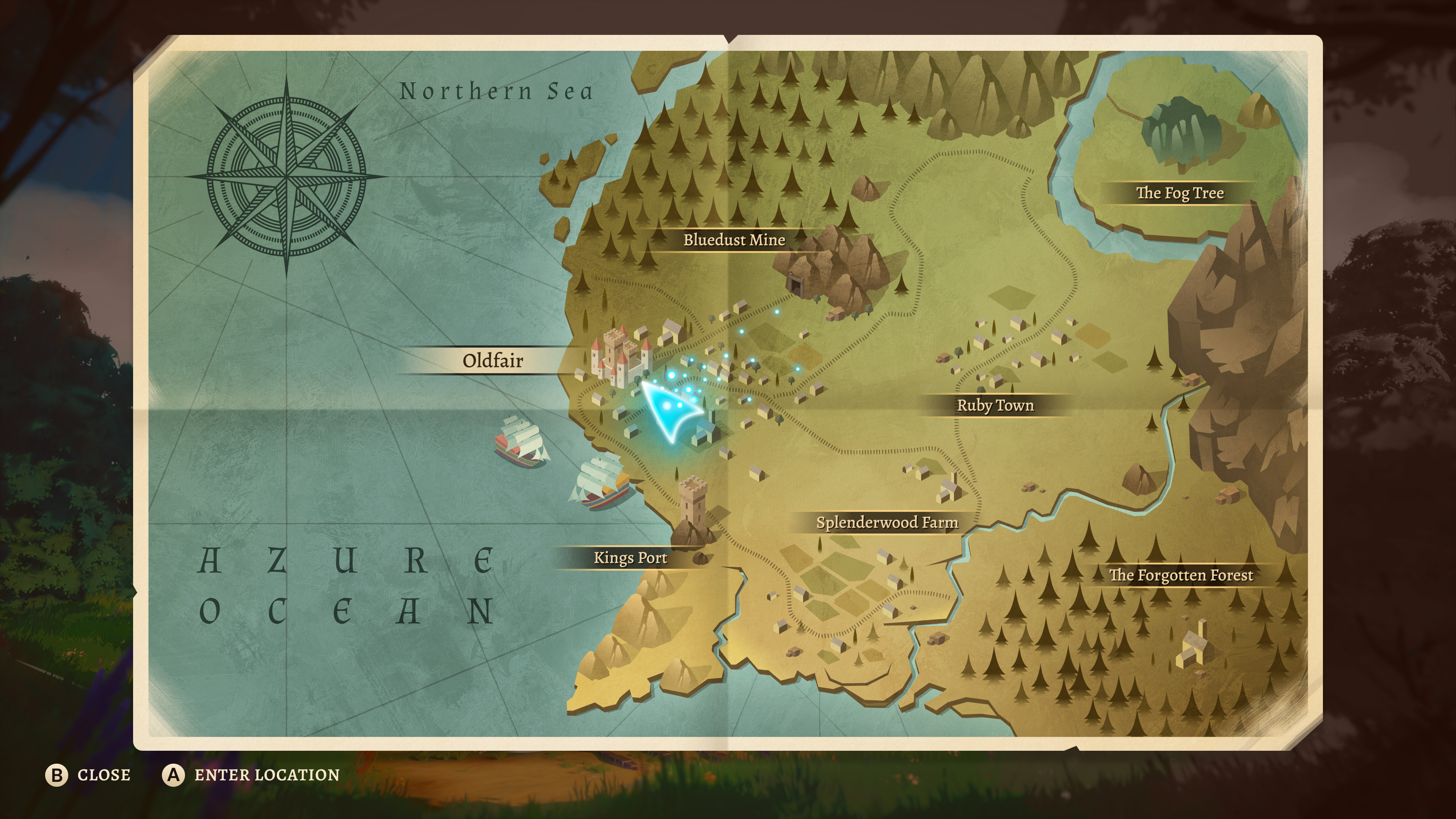
Initial direction was that the game world was in a story book that the player was restoring back to life. I created a book UI concept along with a map
'Warm Pixel'
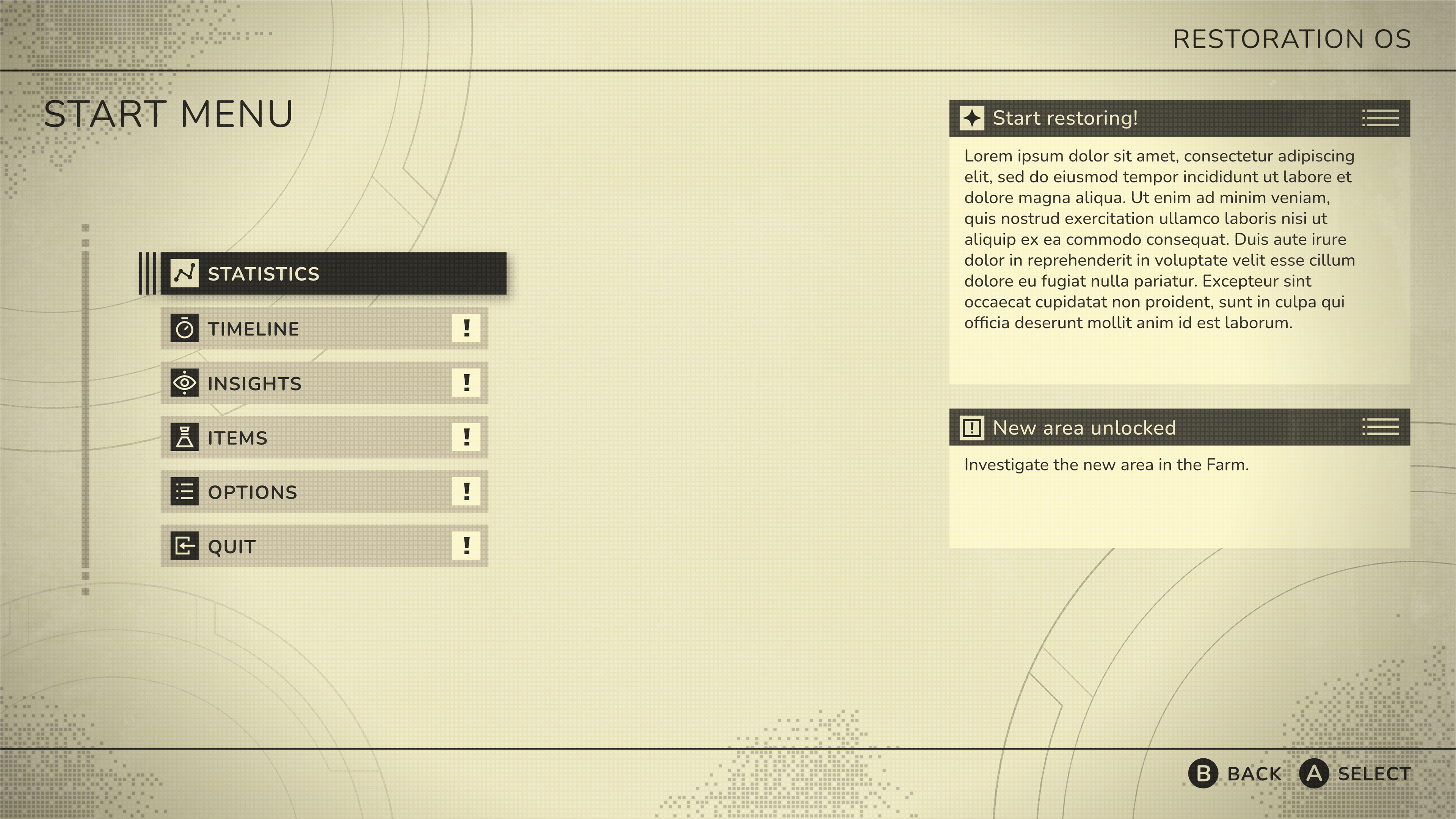
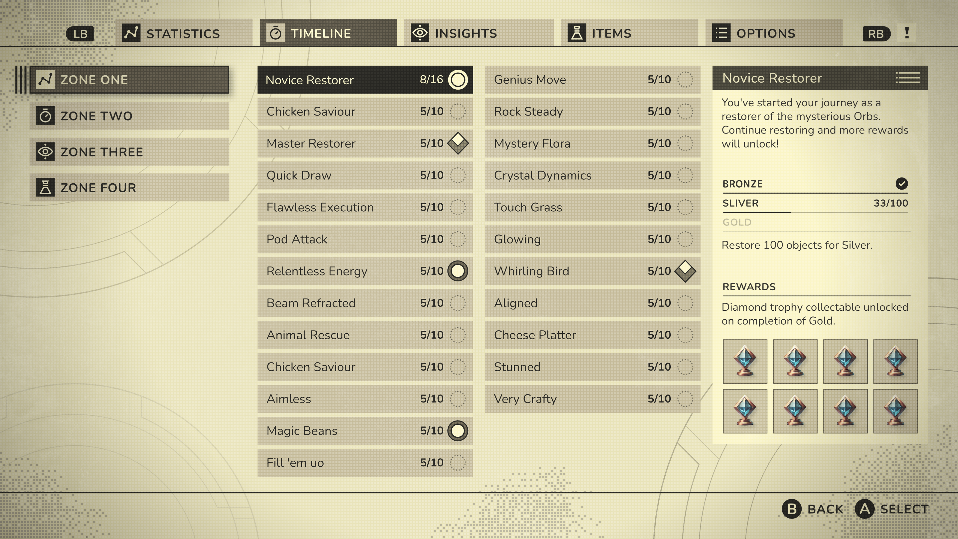
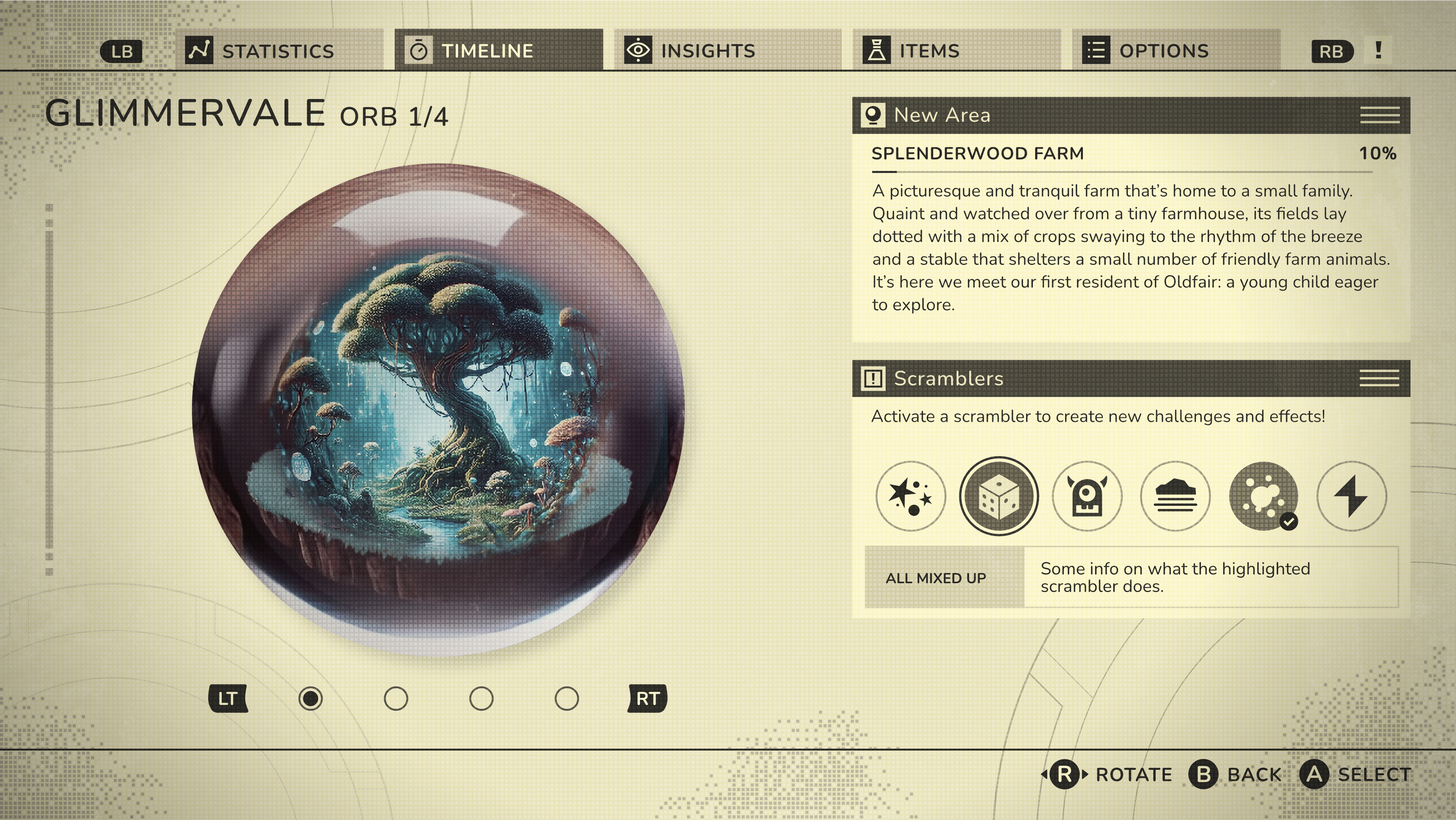
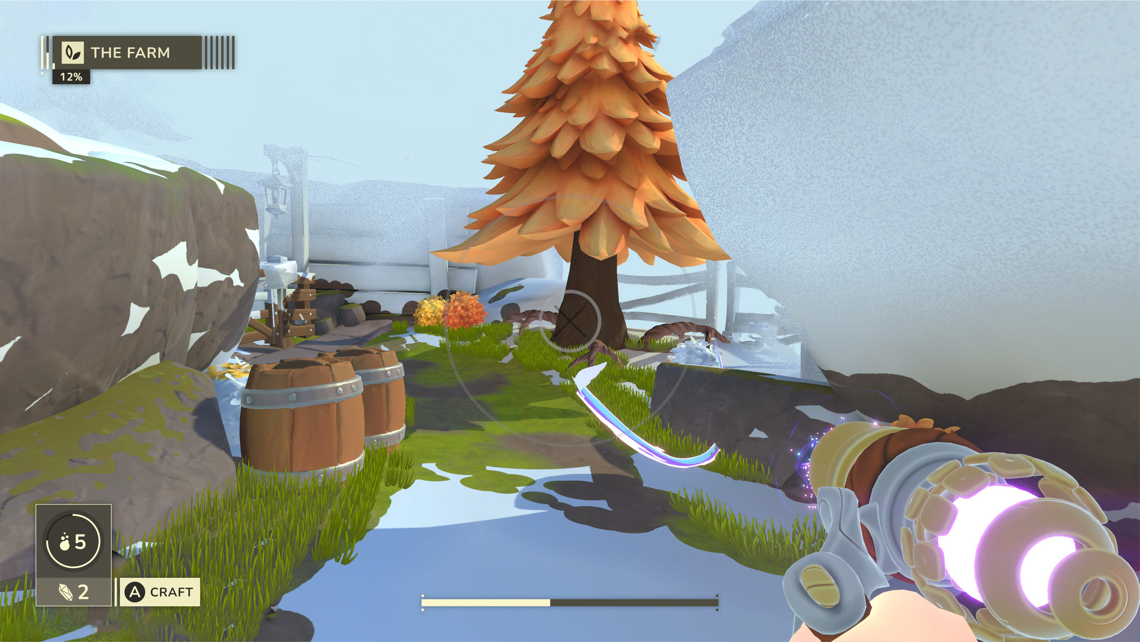
The direction of the game was briefly more a a sci-fi feel.
Using 'Nier Automata' as a reference I tried a monochrome UI that felt like it was on a technically dated display technology with a pixel texture overlay. At this point the concept had changed to restoring 'orbs' instead of books. I used a placeholder orb image the games designer gave me for these mockups.
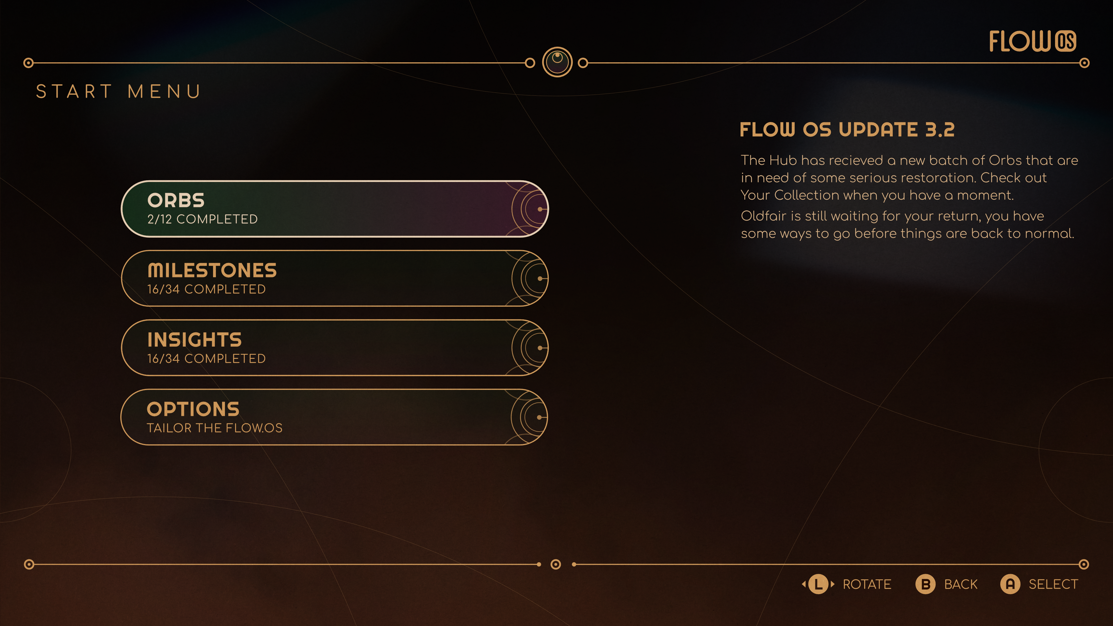
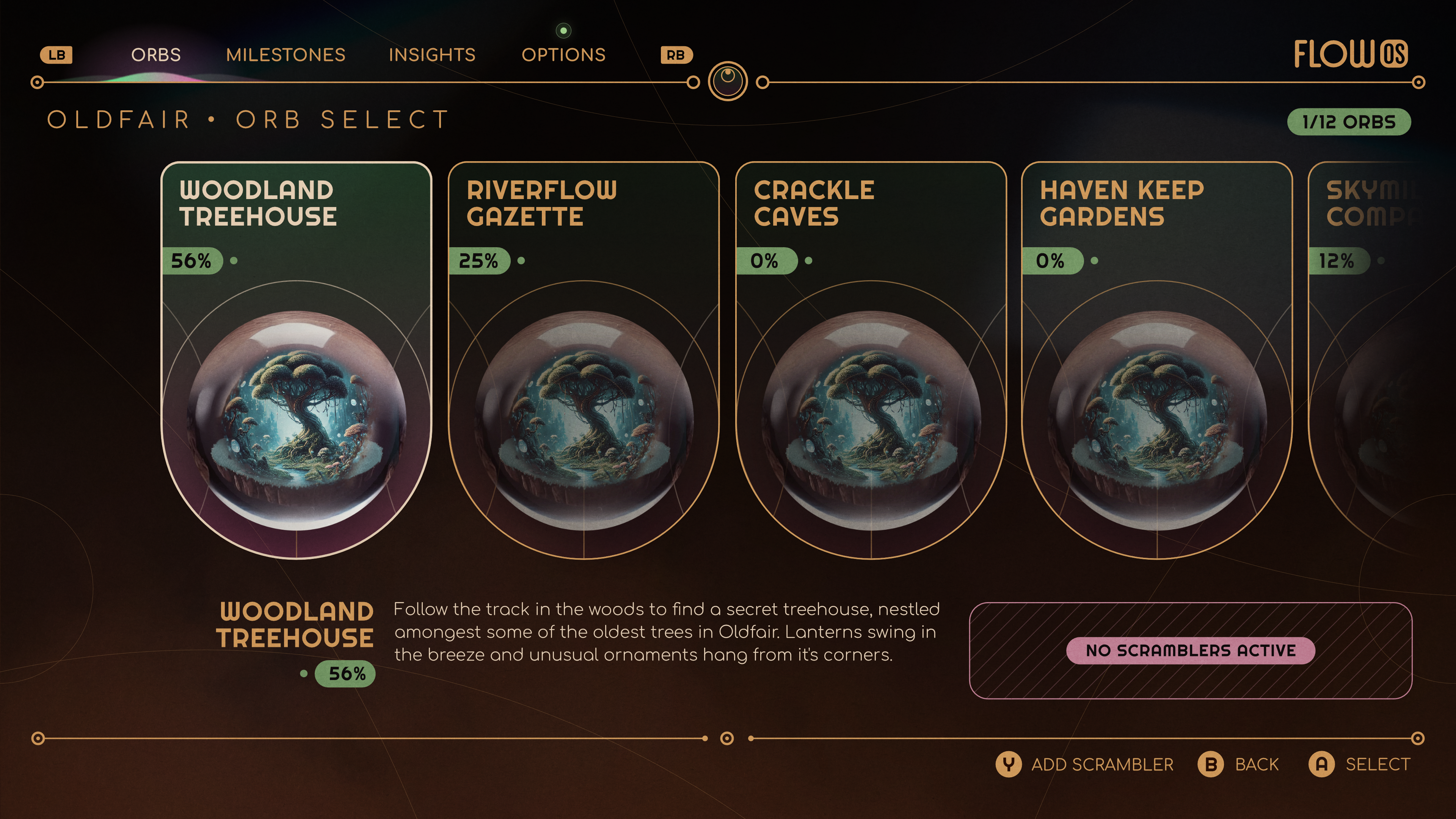
Circle motif on dark background
Using circles for shapes on a darker background to create a bit of an alchemical feel.
'Grey Deco'
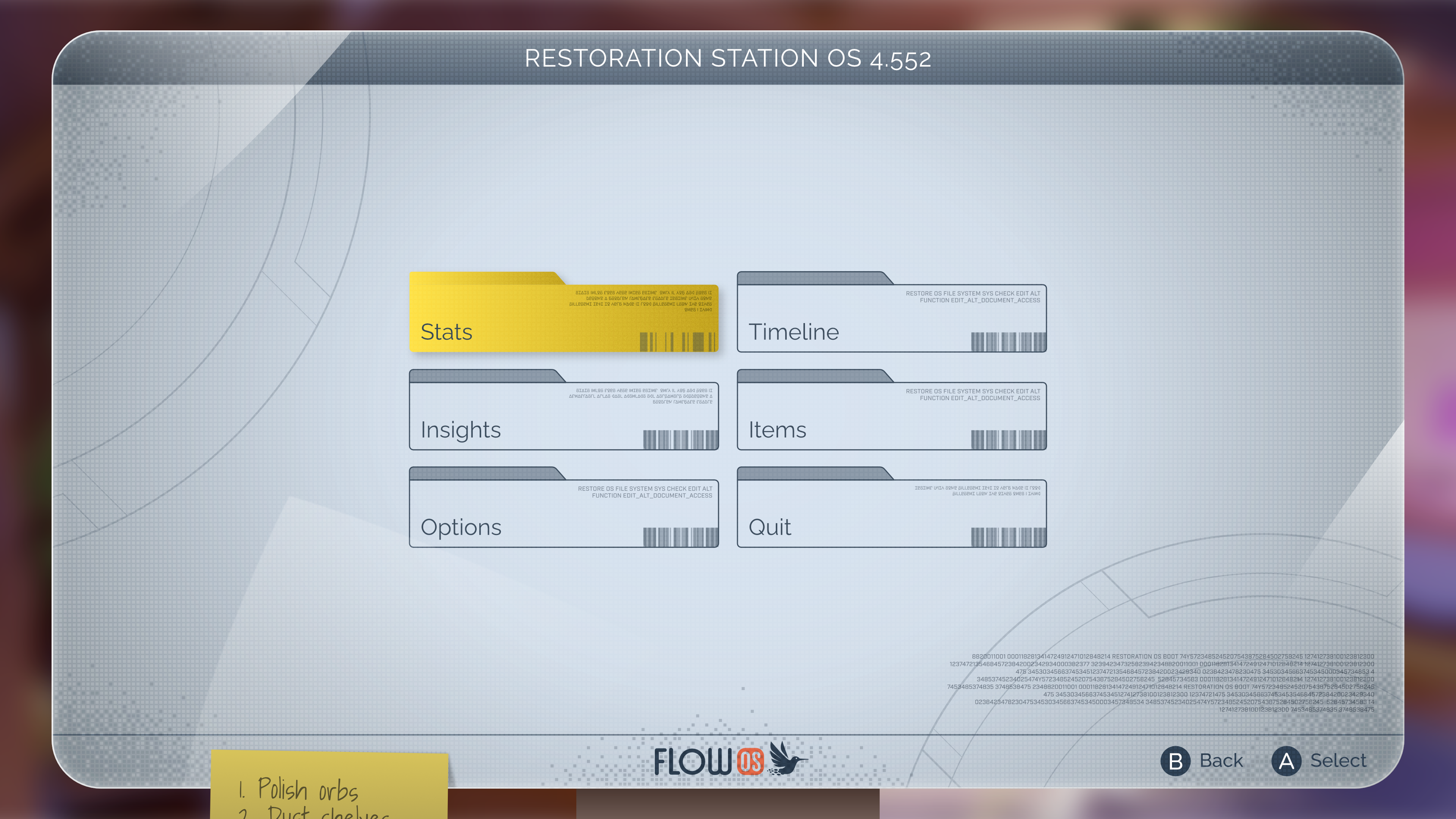
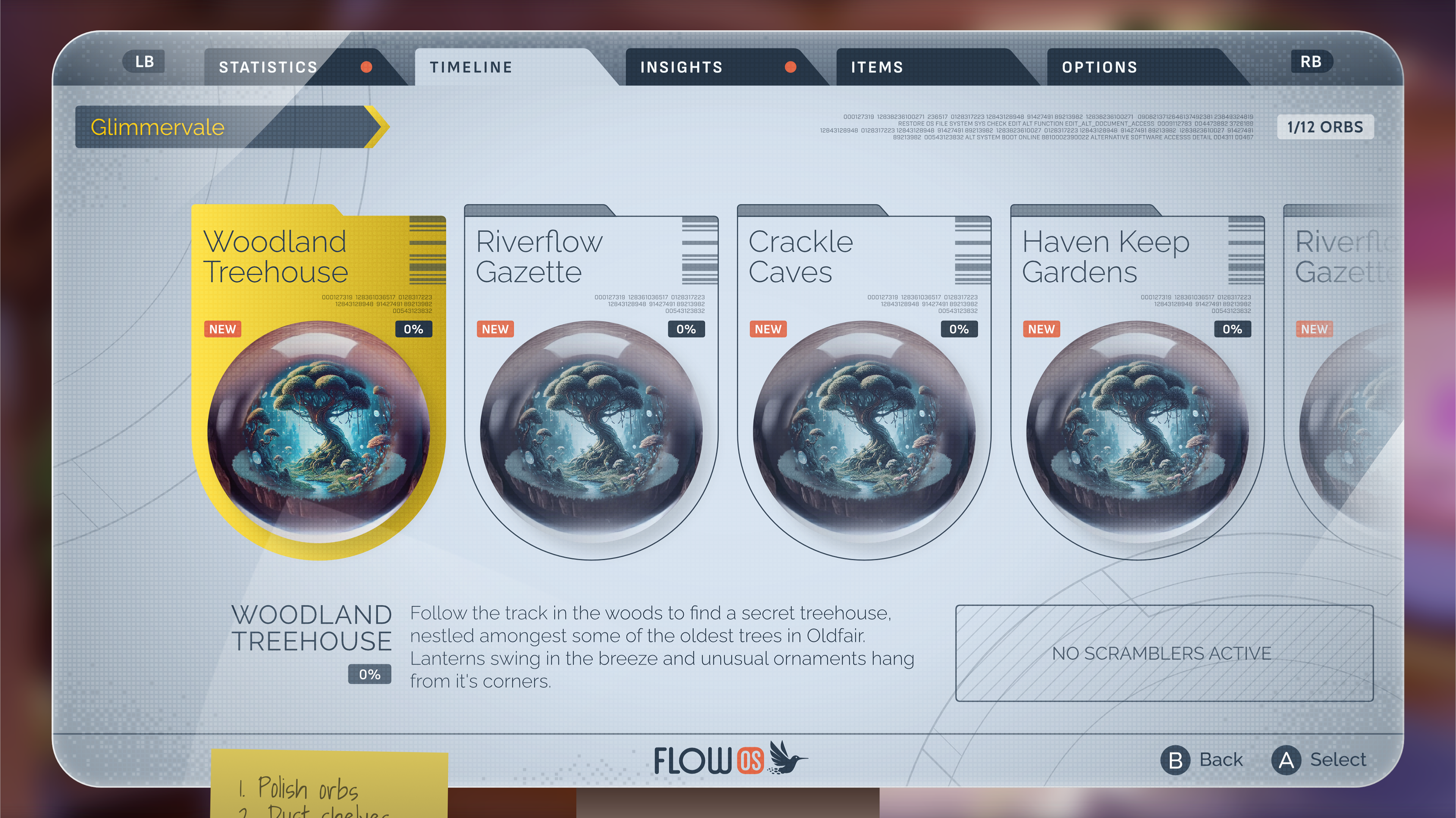
I was given a more specific direction for this, namely Arkane Austin's excellent 'Prey' and it's in-game computer screens. Techy but with a sophisticated, slightly deco feel.
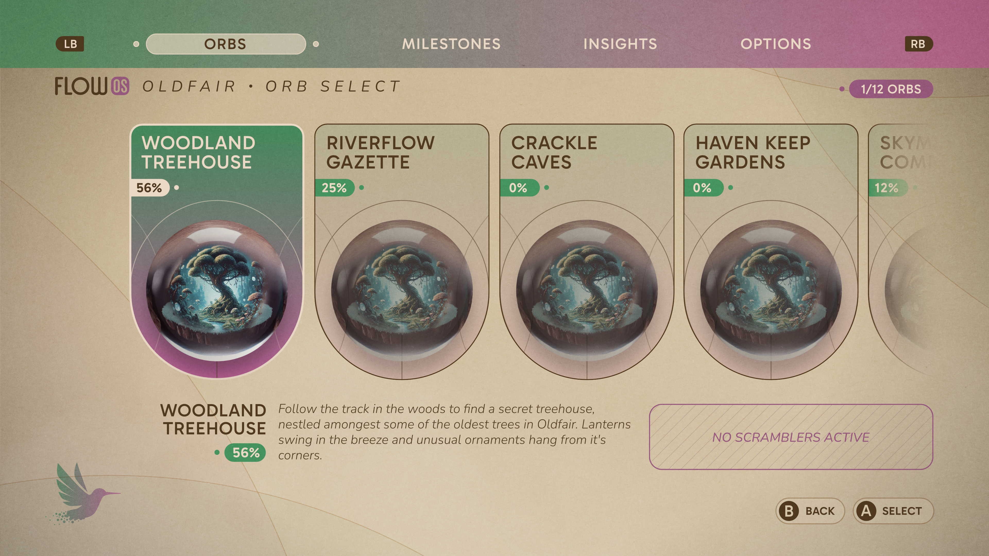
'Grink'
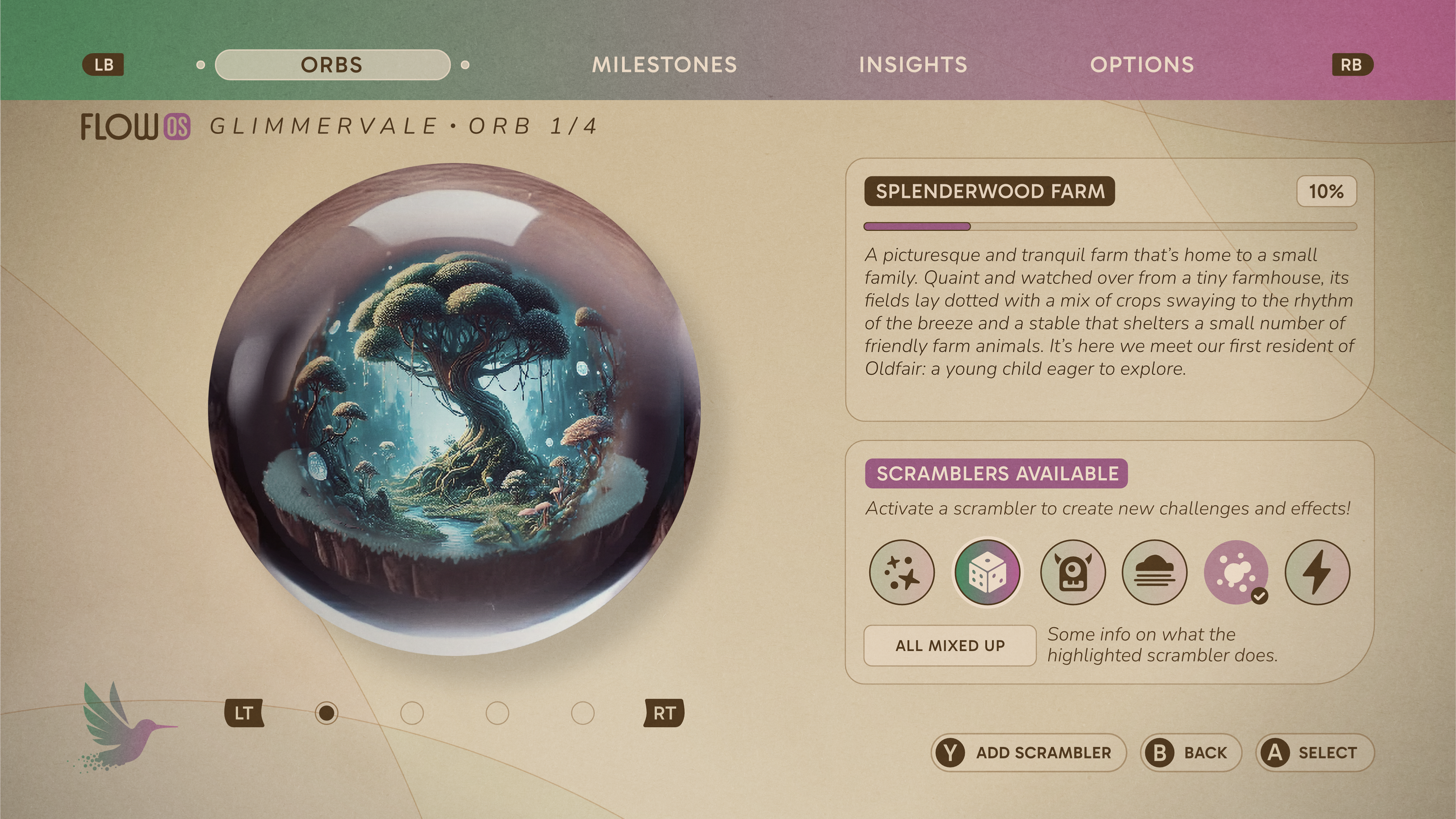
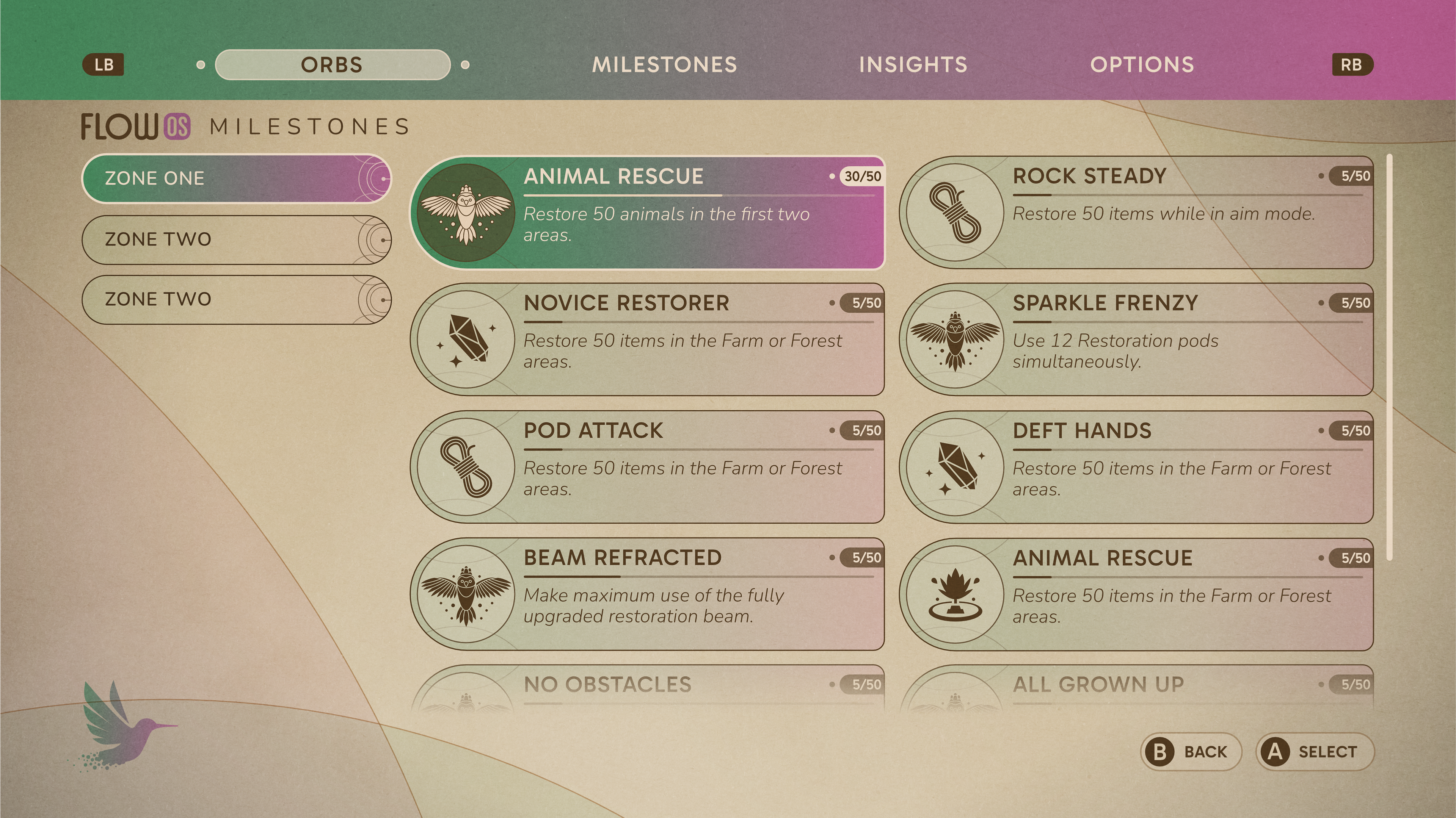
Working with the paper texture we had in earlier mocks, I tried a minimal clean feeling UI. Purple was a colour used in the gameplay a lot at this point so I pared it with green in the UI.
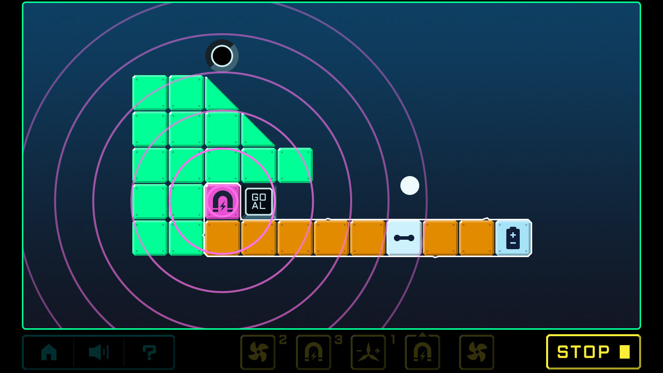
'Engineering'
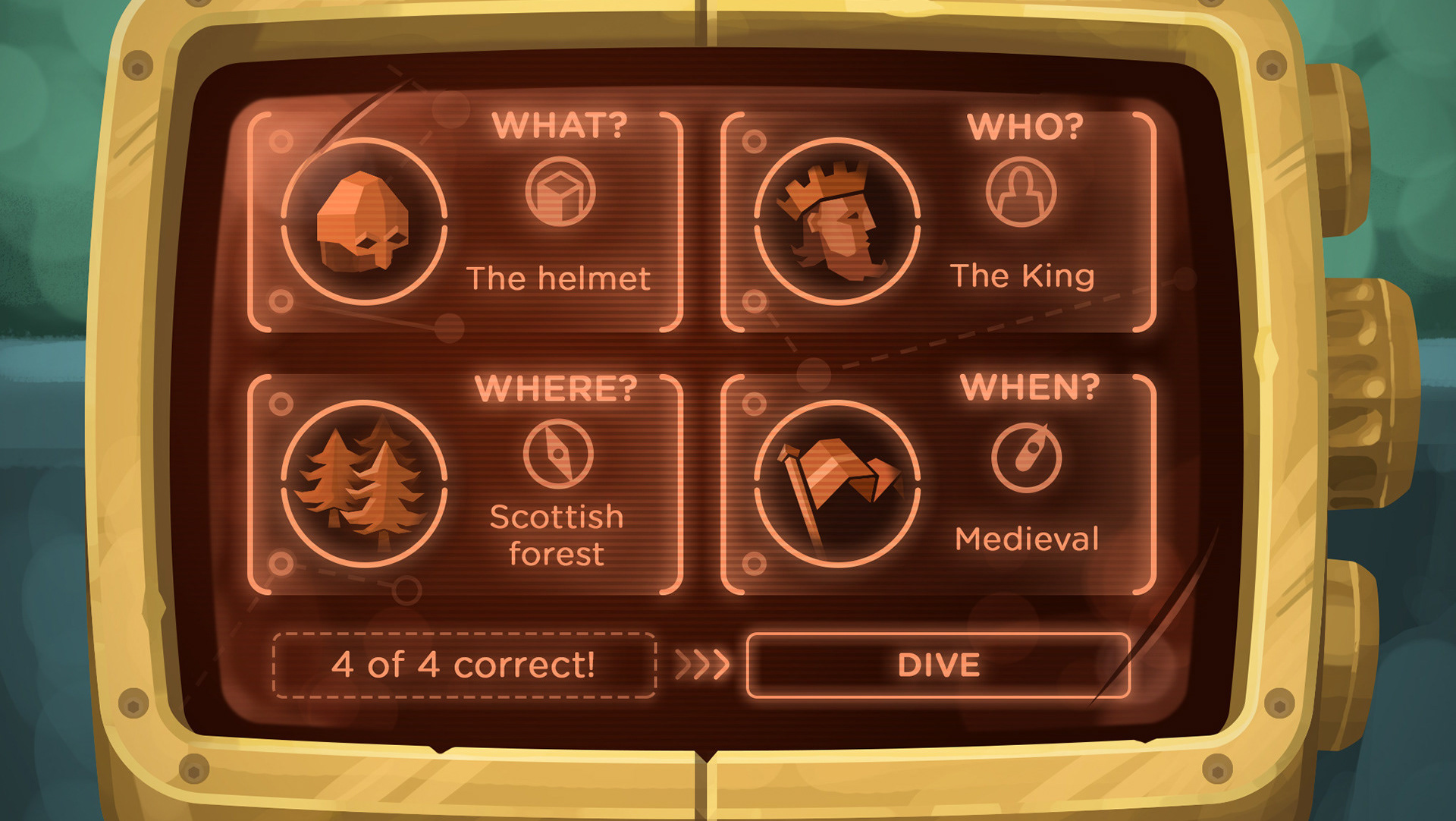
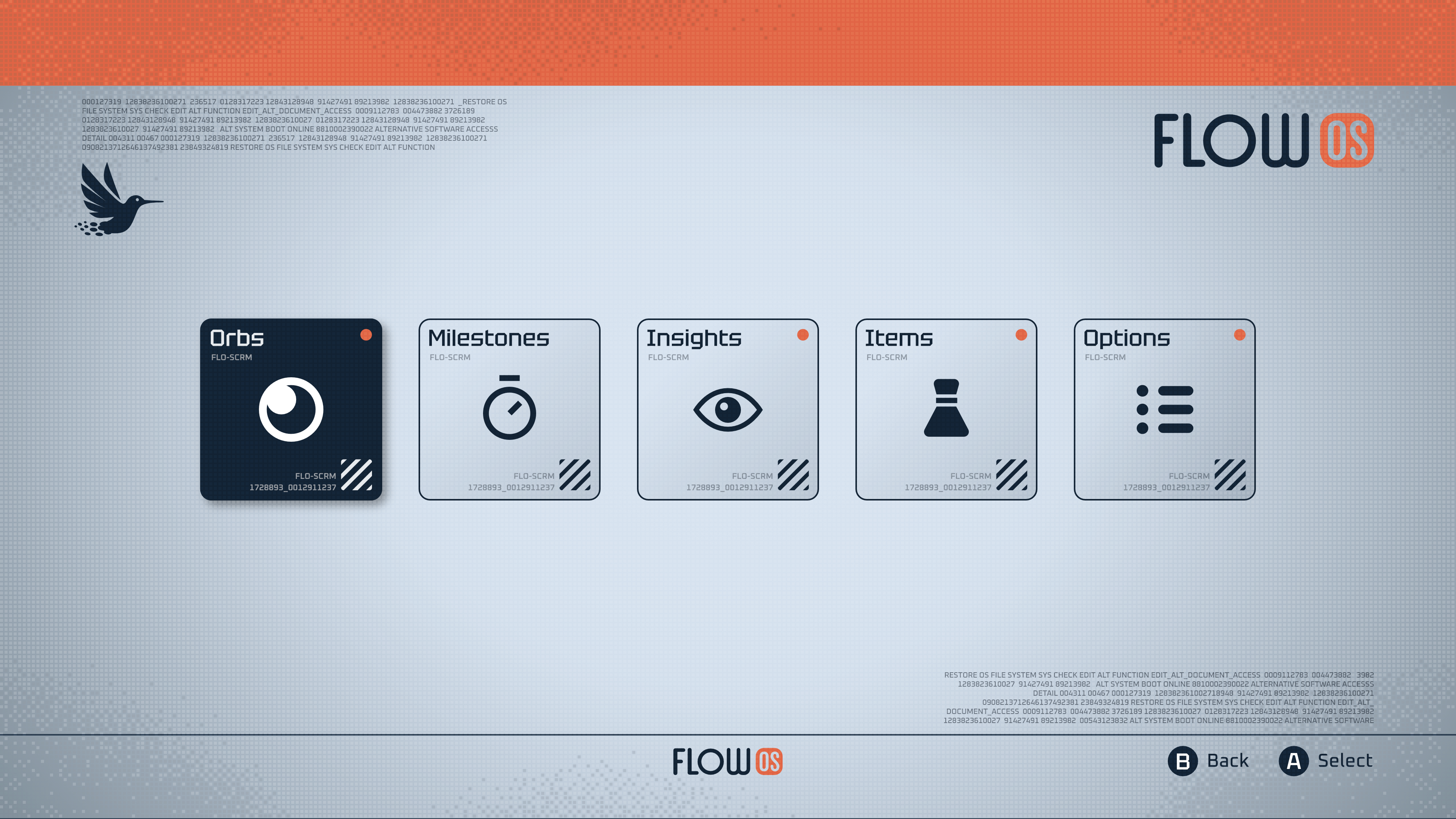
I wanted to create a more workman-like mechanical interface, something you'd use on a device.
I like a few elements here but in retrospect I don't think the slightly odd toned orange works very well.
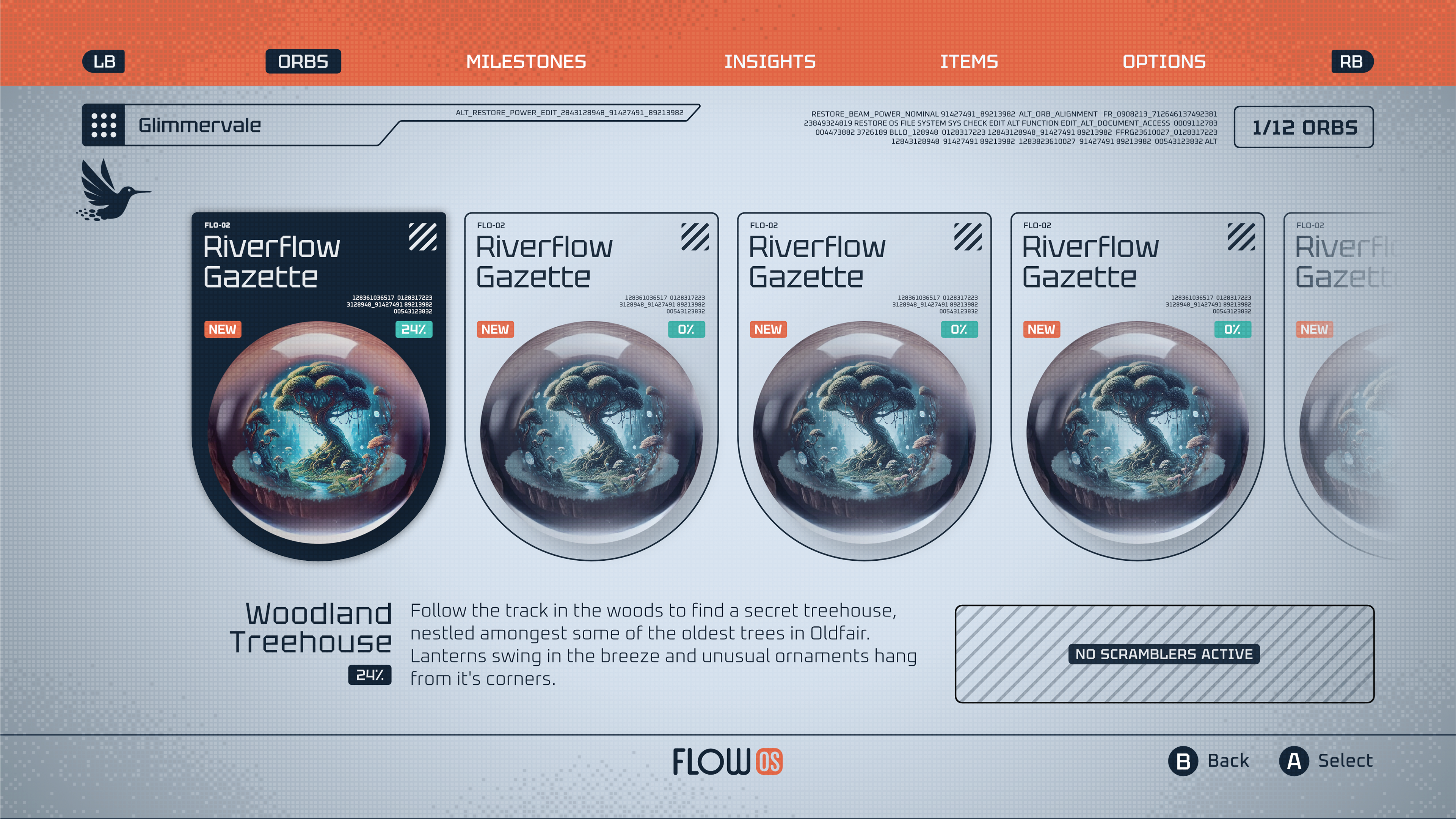
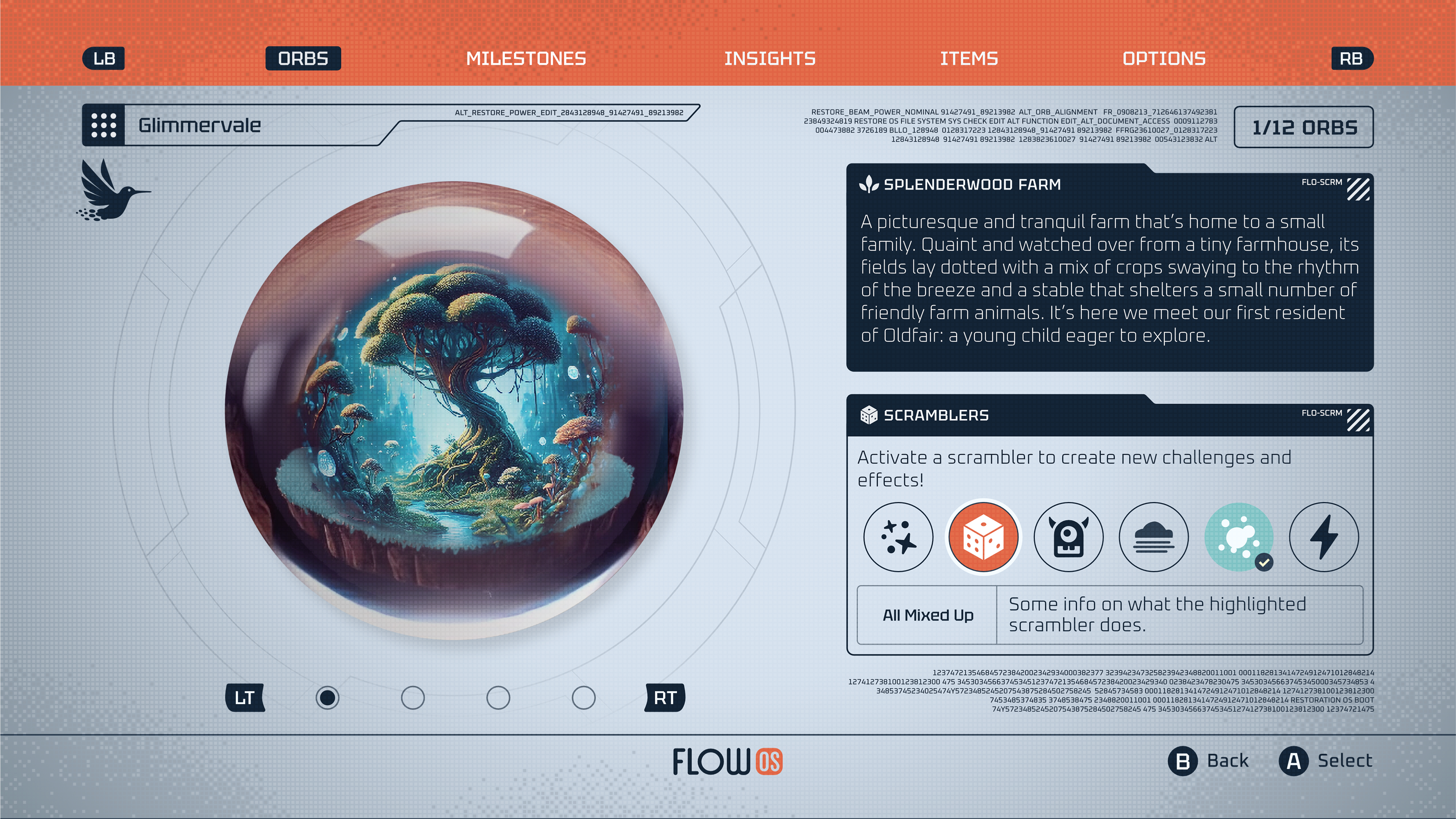
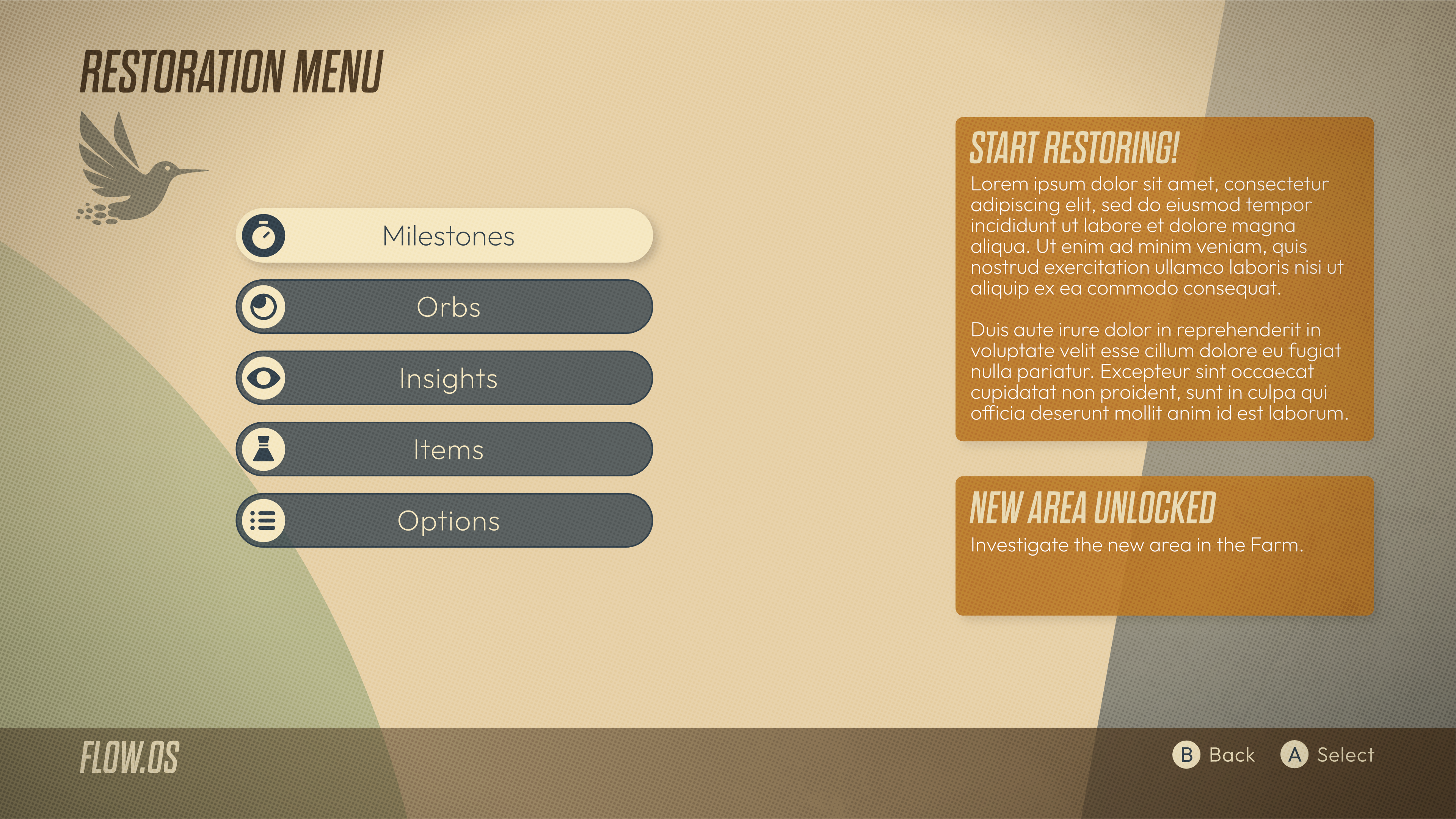
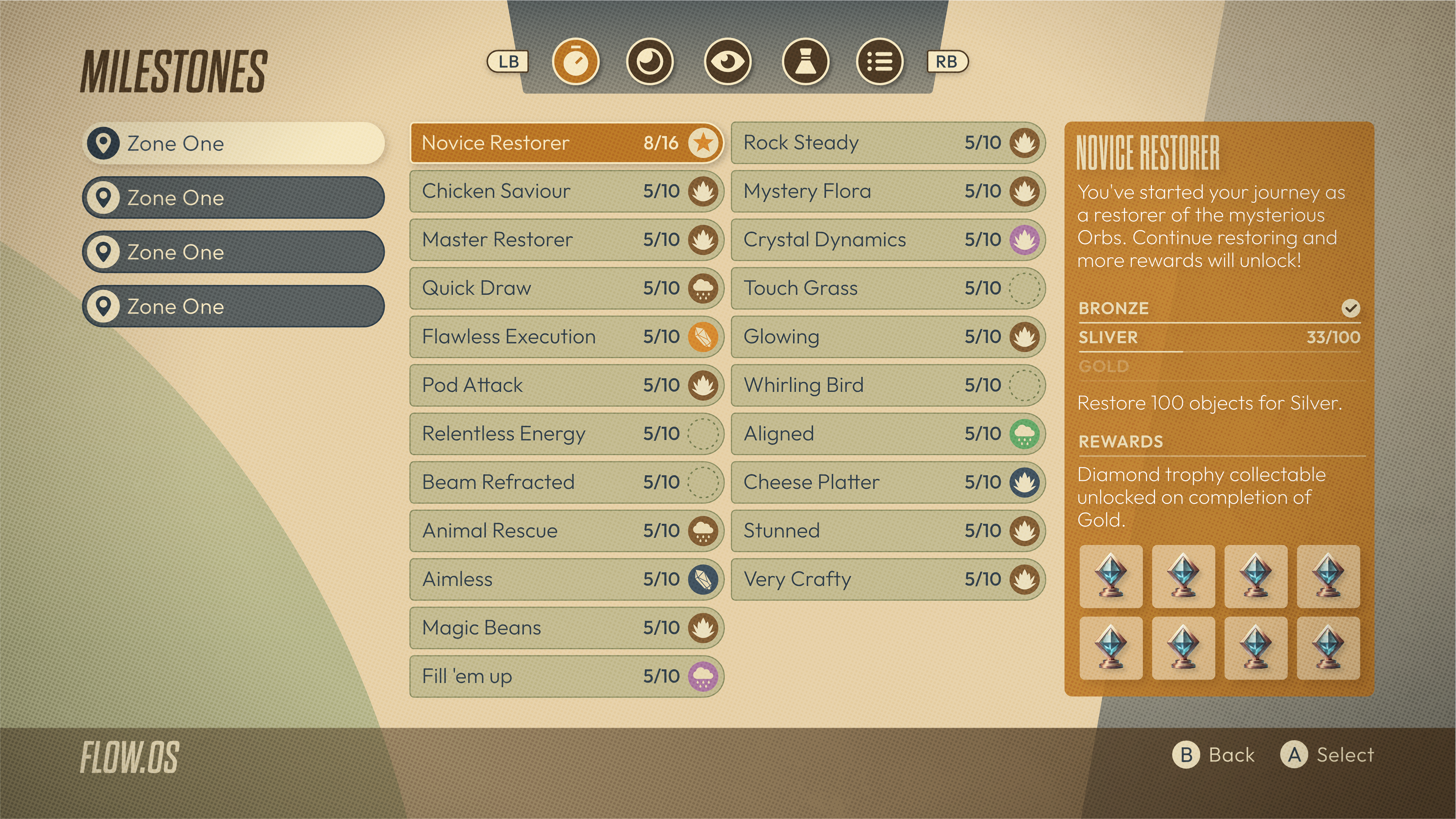
'Wildcard'
I often feel if I've been working for some on different art styles, it's worth a push at the end to quickly create another one while in the zone. It can take some time to get back in that frame of mind again!
I thought I could try something with a bit of a warm 50/60's retro feel.
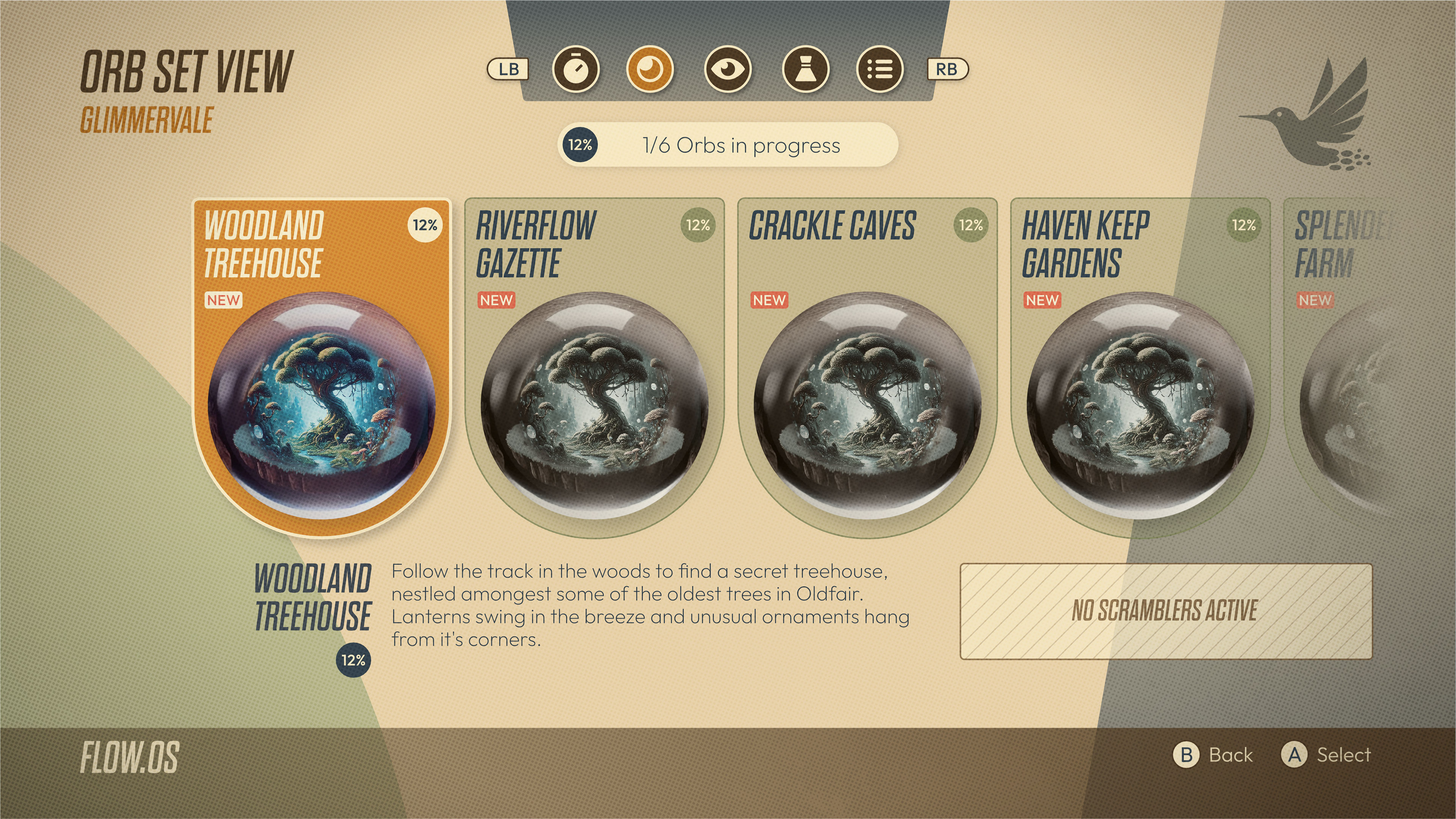
'Punch Cards'
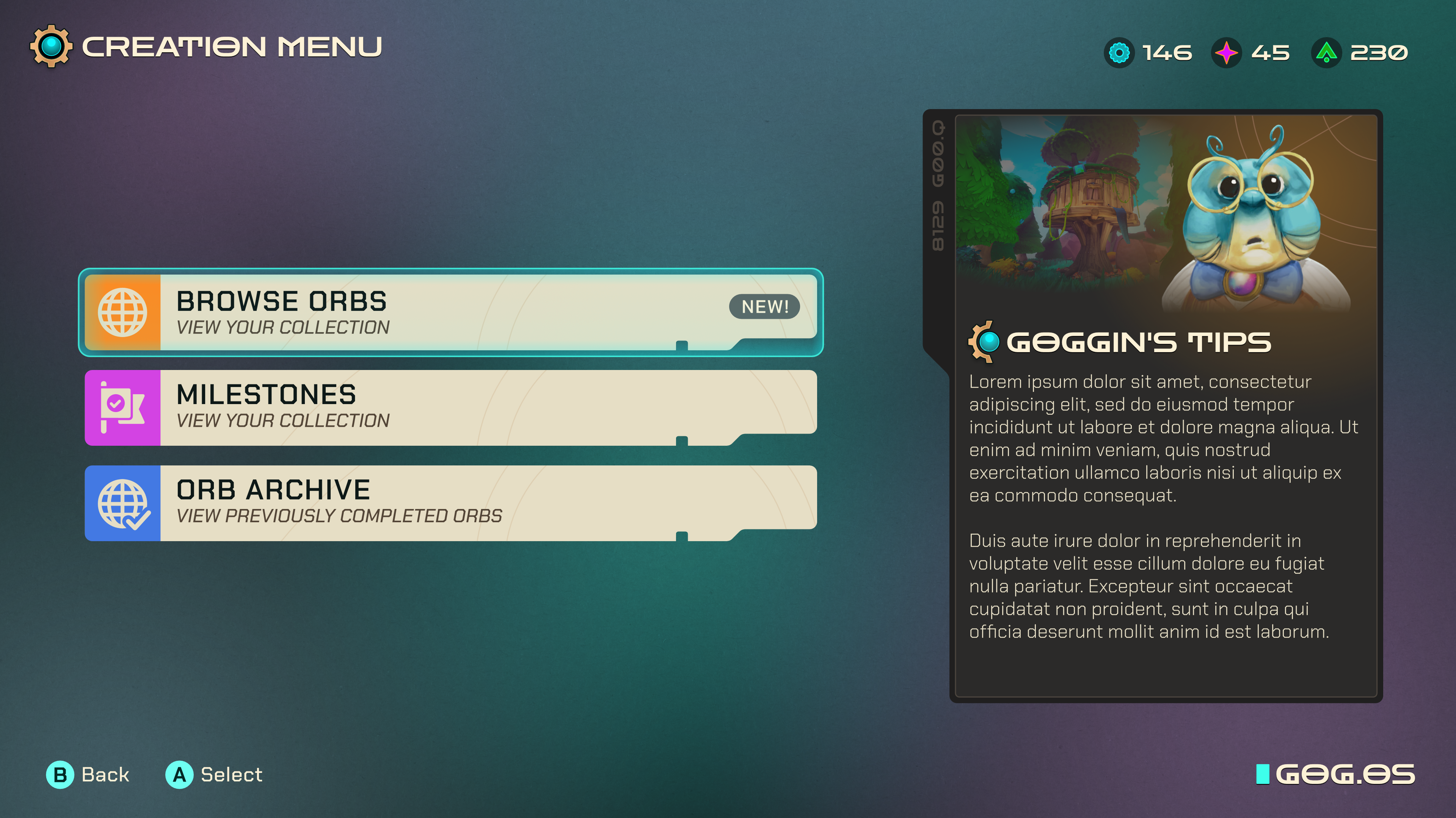
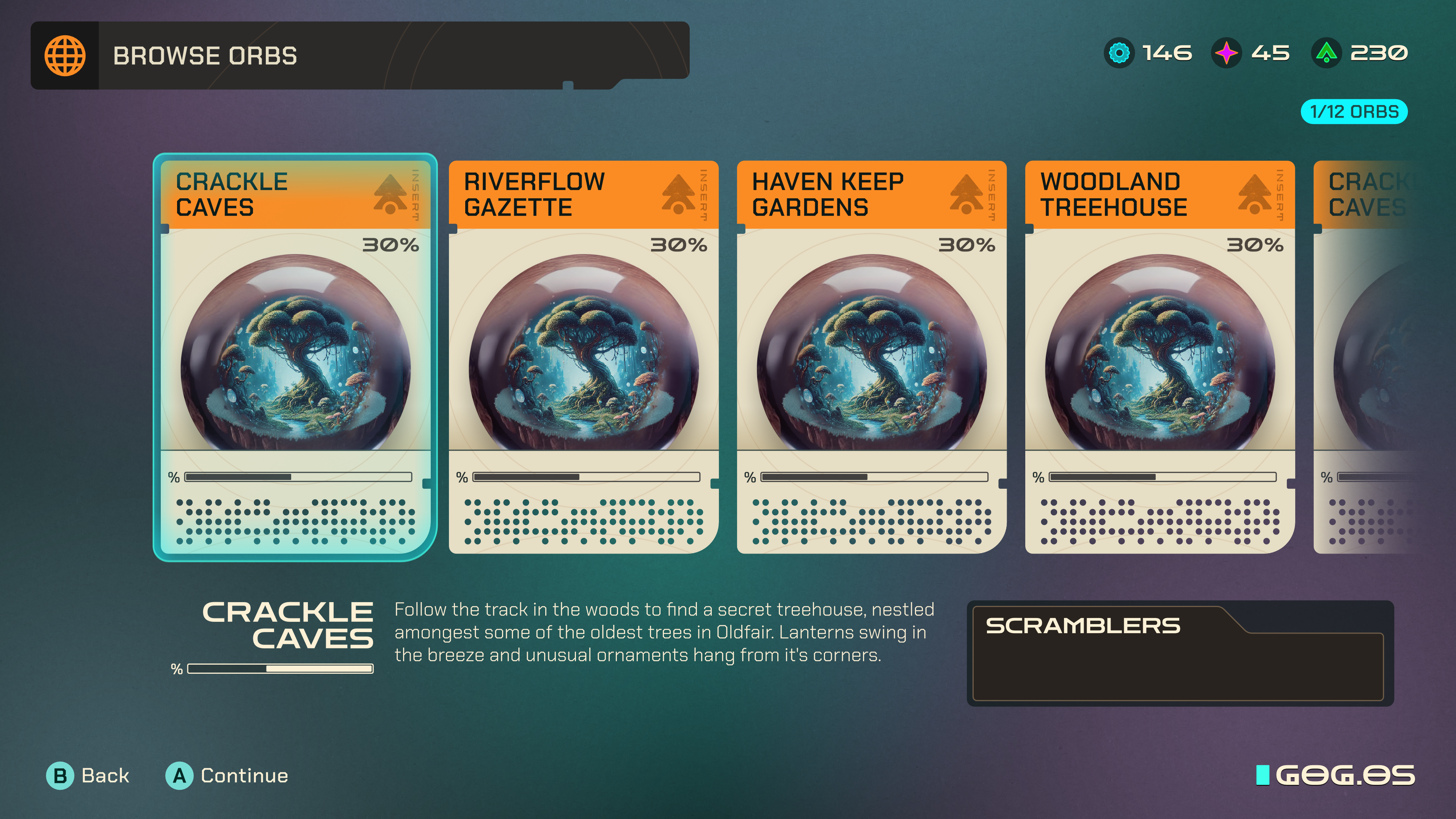
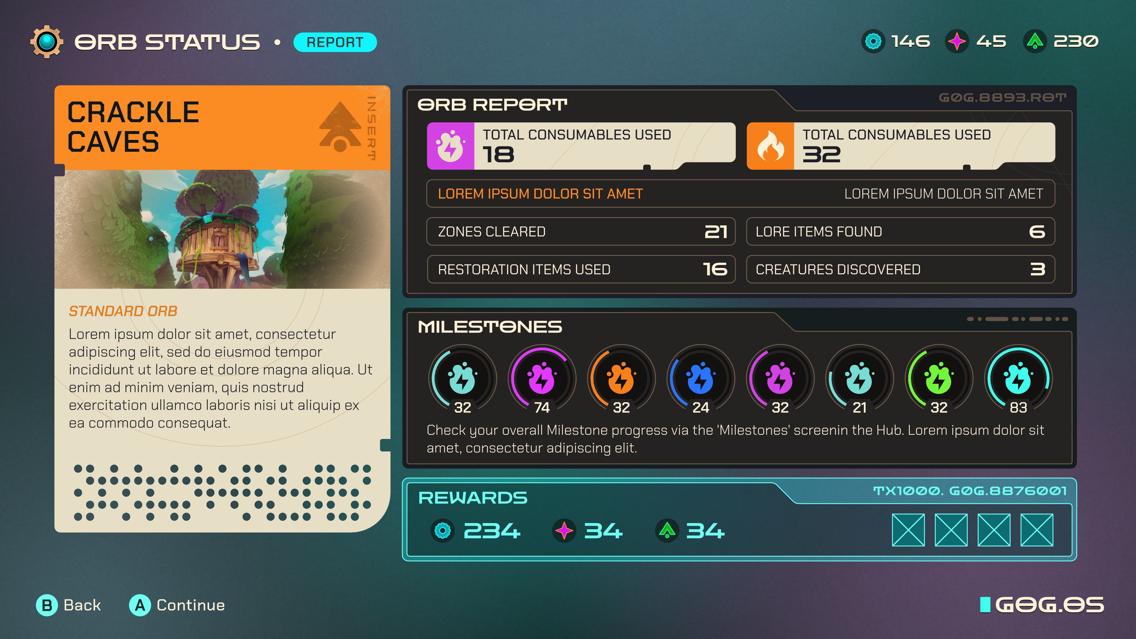
The game setting was a bit antique, a bit fantasy, a bit steampunk. We tried to think of something that would work on a screen in that world and hit upon vintage computer punchcards. The thinking was it would give a light physical feel to the UI without it being heavy and expensively skeuomorphic. I really liked the look of this but felt it was too modern compared to where the art direction was heading.
'Ticket'
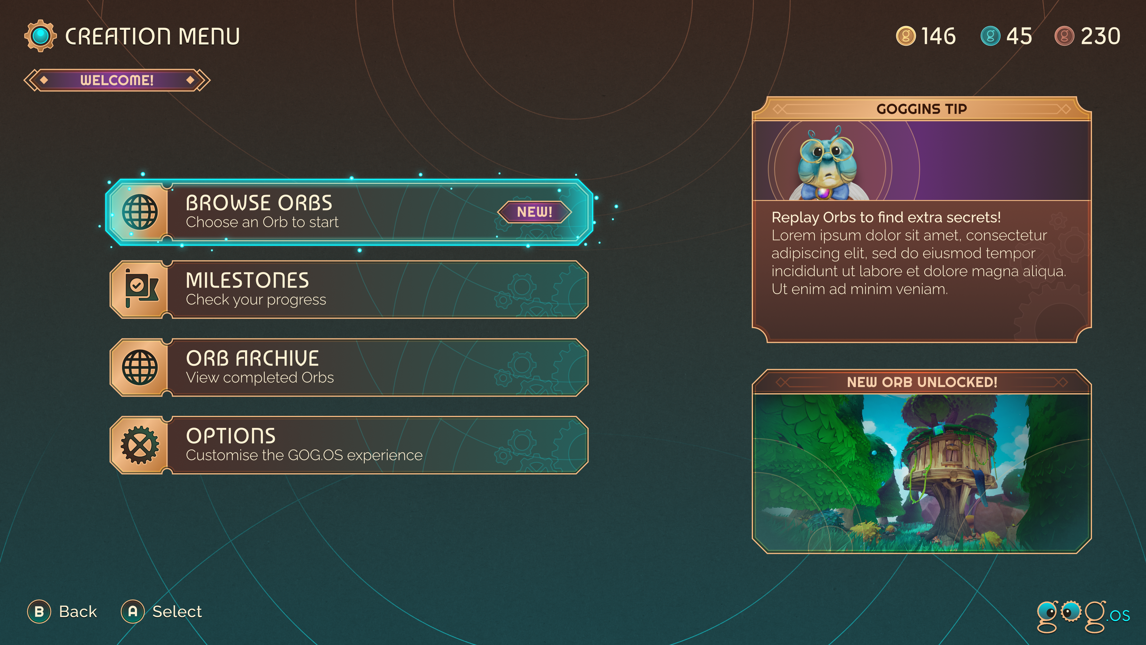
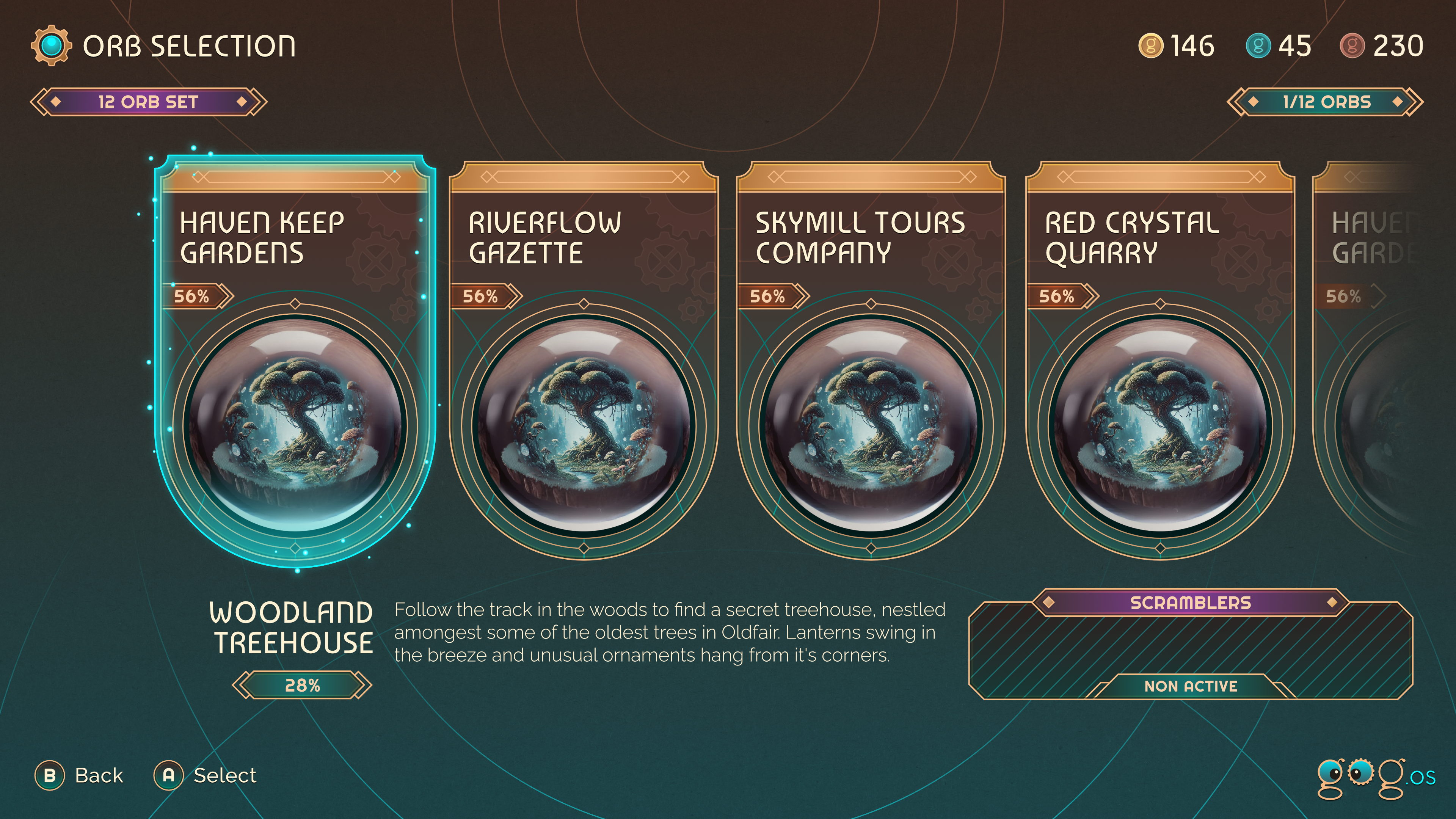
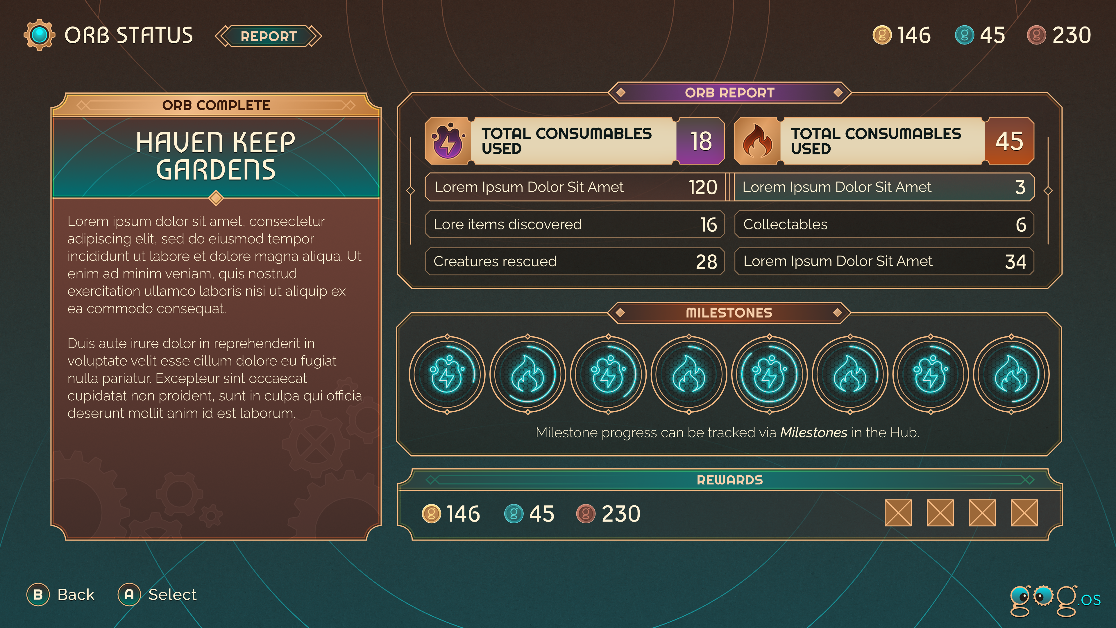
Using the shape of an antique paper ticket as the starting point as an alternative to the punchcards, this style developed into a bit of an art deco feel. I think the colours and shapes worked quite well, but was perhaps too strongly 'period' feeling.
'Hex'
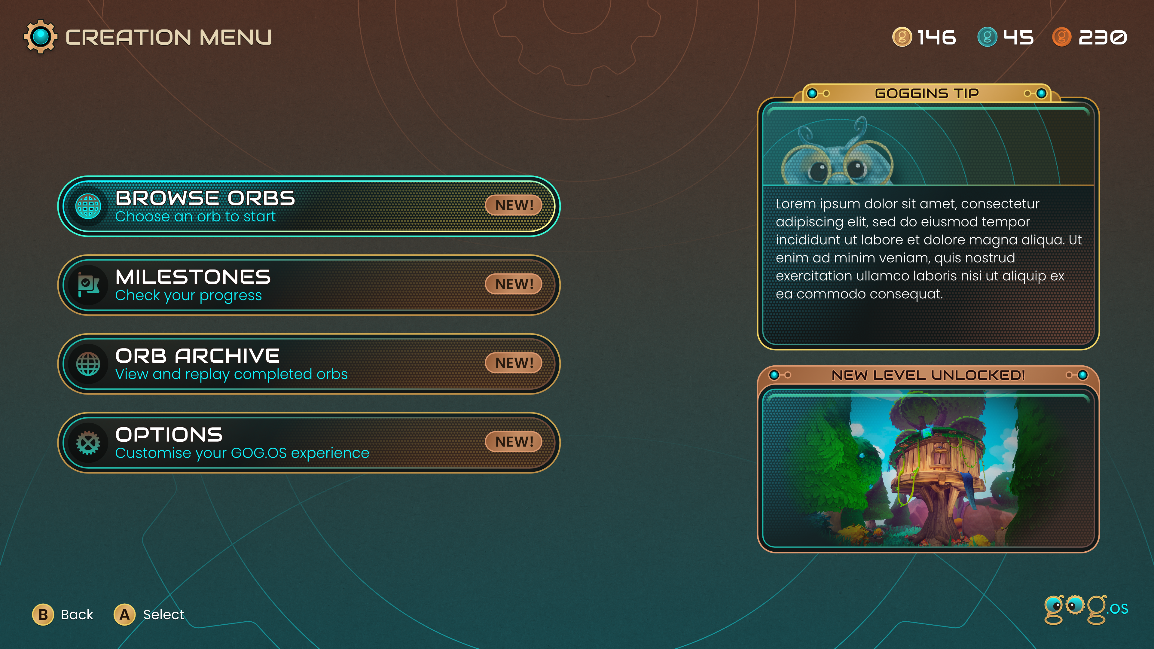
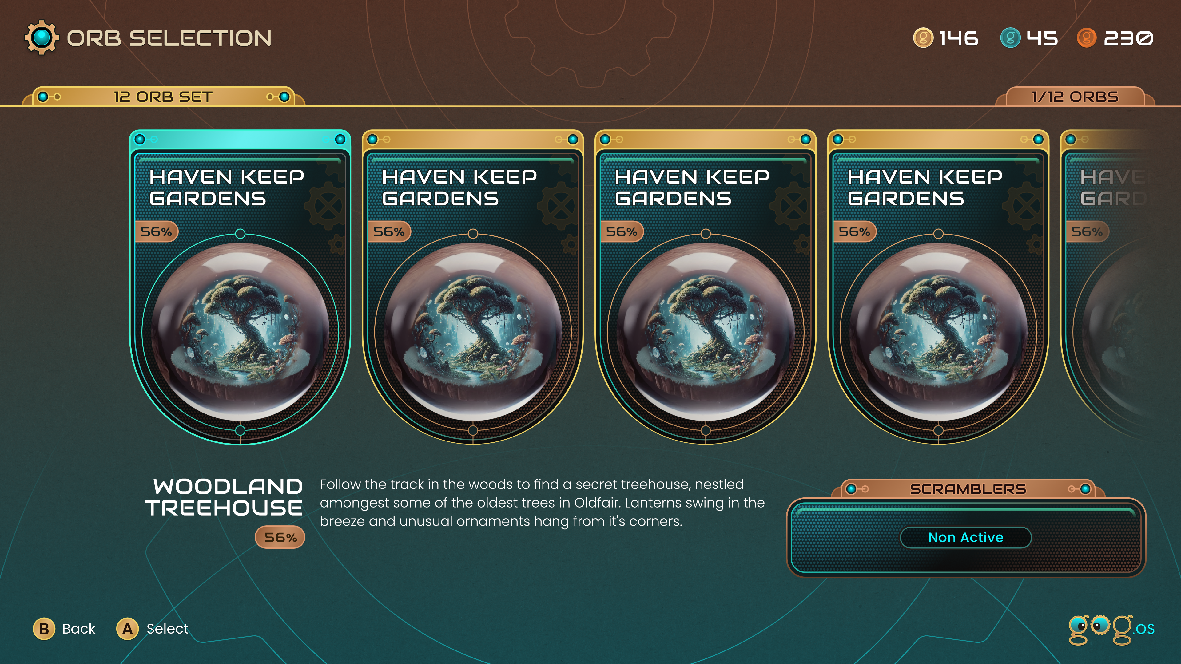
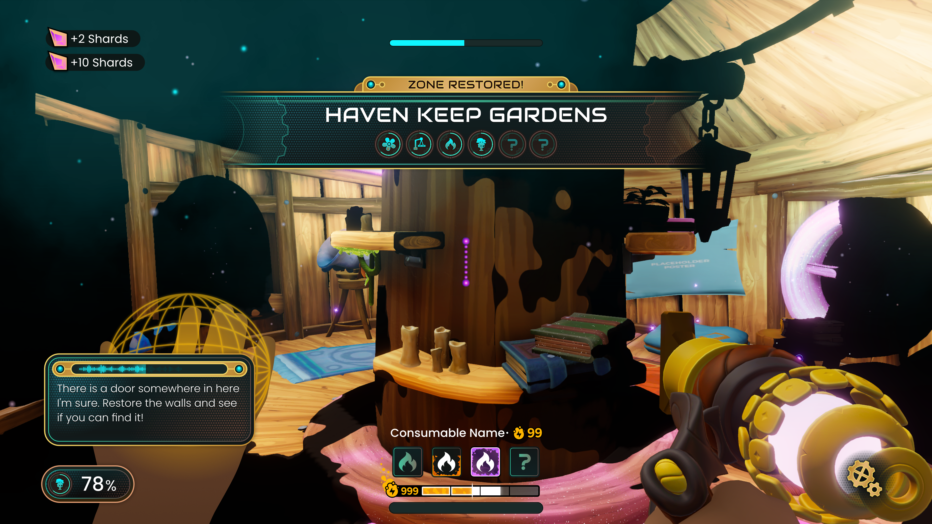
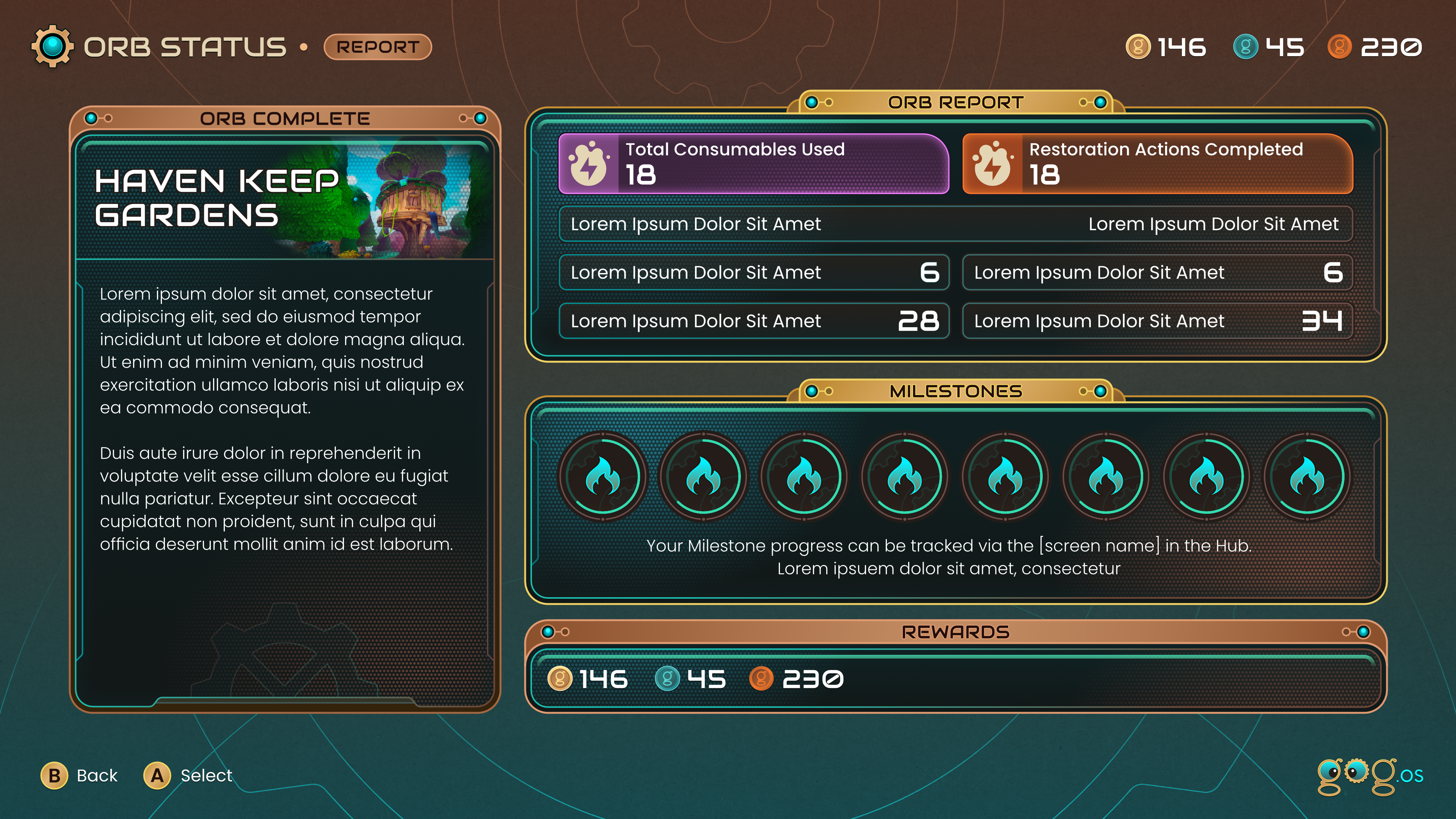
After working up 'Punchcard' and 'Ticket' I felt a more productive route would be with an art style that felt a bit sci-fi and retro, but not too retro. I used a small hexagon texture to suggest a different kind of display tech and the title banners on the chunky feeling boxes have a bit of a deco feel. I think this had the most potential, but needed more work (especially the HUD).
Unfortunately I found out the project had been cancelled just after I'd got the mock ups to this stage.